
Building forms
The form builder controls the questions, layout, validation, styling, and behaviour of a Team Form. Start from a blank form, a template, or a form created by the AI assistant, then refine it with the drag-and-drop builder.
Add and arrange components
Section titled “Add and arrange components”Components are the building blocks of a form. Input components collect values, while layout components such as panels, fieldsets, columns, and content organise and explain the form. Select a component to configure its label, property name, validation, data, conditional behaviour, and display options.
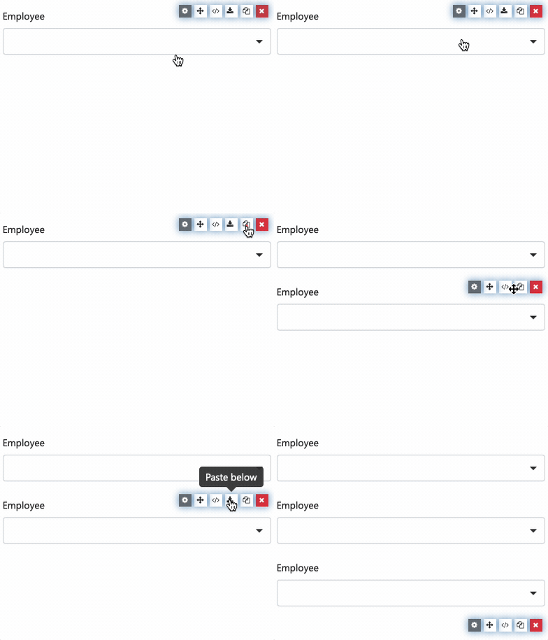
You can copy individual components or a whole section within the same form. Hover over the component, select the copy icon, then choose where to paste it.
The Help library contains focused references for individual components, including files and attachments, data grids, signatures, addresses, and layout columns.
Design the layout
Section titled “Design the layout”Use panels or fieldsets to group related questions, and columns to place fields side by side. Keep layouts responsive: narrow screens will need more vertical space than the desktop builder preview suggests.
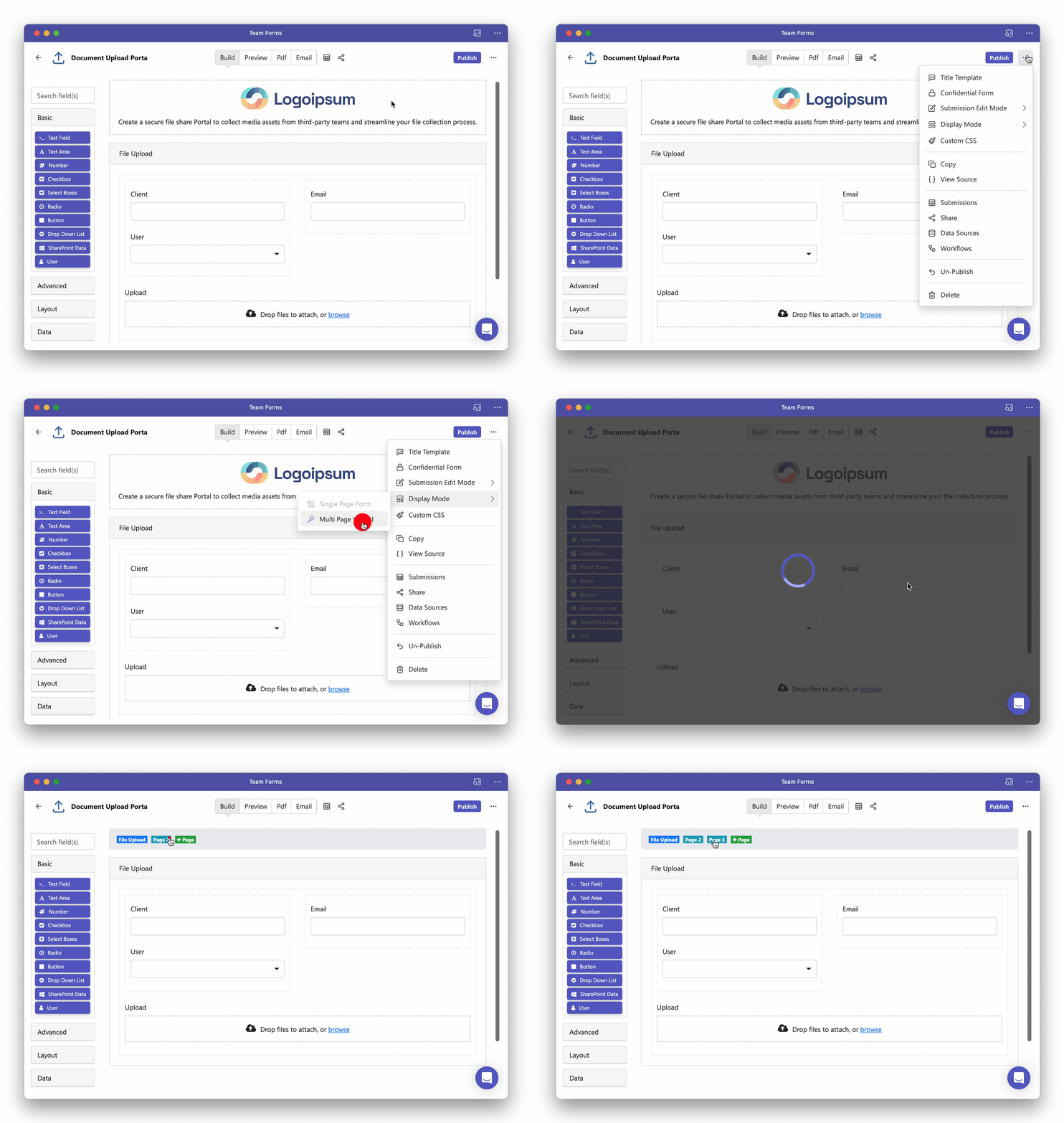
For longer forms, switch Display Mode to Multi-page wizard from the builder’s … menu. The page tabs then let you add, arrange, and rename pages.
Use the standard display settings first, then add custom CSS only when the builder cannot achieve the required design. Useful layout recipes include placing questions side by side, changing form width, and adding a company logo.
Add validation and logic
Section titled “Add validation and logic”Configure required fields and validation rules in the component settings. Conditional logic can show, hide, enable, or calculate fields from earlier responses. Simple conditions cover common cases; advanced conditions and calculated values use JavaScript.
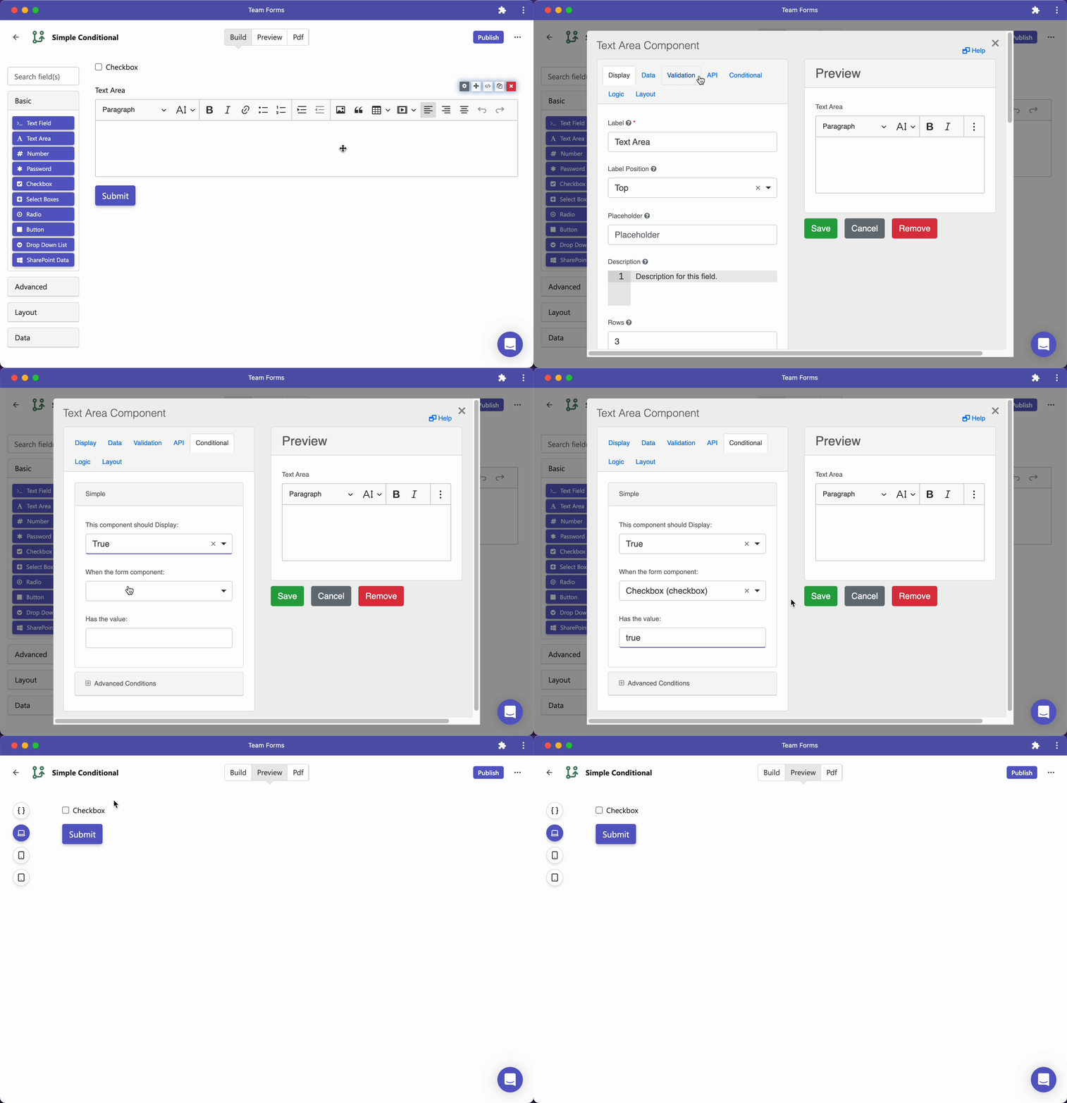
When one field references another, use its Property Name, not its visible label. For selection fields, conditions usually compare the stored Value, not the displayed label. See calculated fields, conditional visibility, and field validation for detailed examples.
Test before publishing
Section titled “Test before publishing”Use Preview throughout the build. Test required fields, conditional branches, mobile layouts, page navigation, uploads, calculations, and the PDF output. Publishing makes the current draft available to responders; it is not required for authors and reviewers to preview a draft.
For exact component types and source JSON properties, use the Form schema API reference. The focused references for component response values, nested and repeating components, and directory-user fields cover the shapes used by calculations, conditions, emails, and integrations. For a specific task or component, search the Help articles.